Team

Tools

Time frame

Background

In January of 2020, mHelpDesk, a field service software platform based in Northern Virginia, became a part of Angie's List (now rebranded to Angi) a ratings and reviews website for home projects based in Indianapolis, IN. Before the integration, mHelpDesk was acquired by but ran separately from, HomeAdvisor in 2014. HomeAdvisor and Angie's List are both under ANGI Homeservices which holds other home service companies such as Handy and HomeStars.
With the mHelpDesk to Angie's List merge, the Design, Product, and Engineering teams from both companies worked together to integrate mHelpDesk's main suite of products, BMT (Business Management Tools) into Angie's List for their service providers. The products were estimates for jobs, invoicing for jobs completed, and payments between the pro and homeowner, whether partial or full.
Problem
The initial payment work integrated from mHelpDesk was backed by Square and would require pros to have a Square account to collect payments from their customers. Another limiting factor was that pros could not tie those Square payments directly to invoices they'd created for their customers. This presented a few problems in that we knew not all Angie's List pros had Square accounts and invoices being separate from payments made it hard to track payments for work done and stay on top of overdue invoices.
Survey
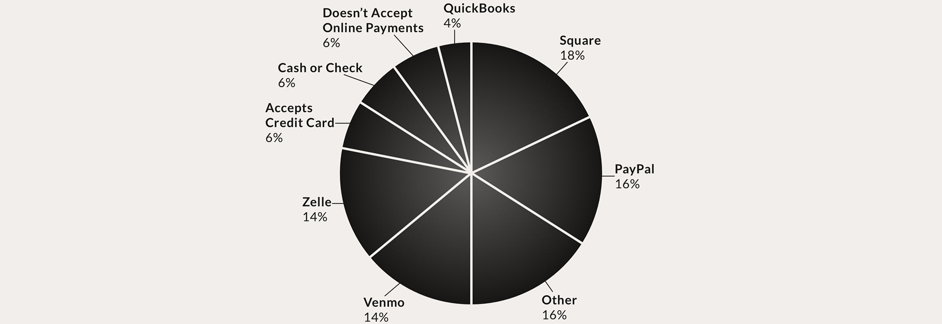
In August of 2020, a survey was conducted with 496 Angie’s List pros to understand what pros already use for taking payments and what would be a compelling value prop for them to use Angie’s List to collect payments from their customers. Here are the survey results:
1) Which of the following online payment methods do you currently use to take customer payments?
2) What was most important to you when deciding which online payment method(s) to use to take customer payments? (i.e. lowest fee percentage, rewards, incentives, etc.)

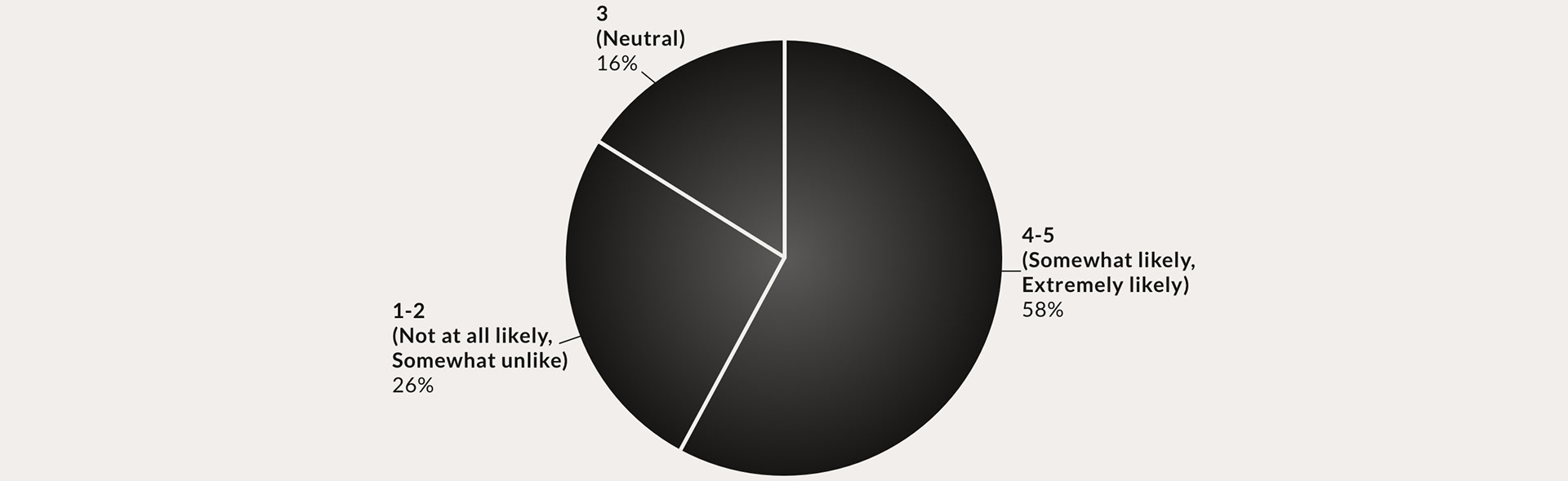
3) If Angie's List offered an option to collect customer payment through our platform, how likely would you be to consider using it? (1-5)
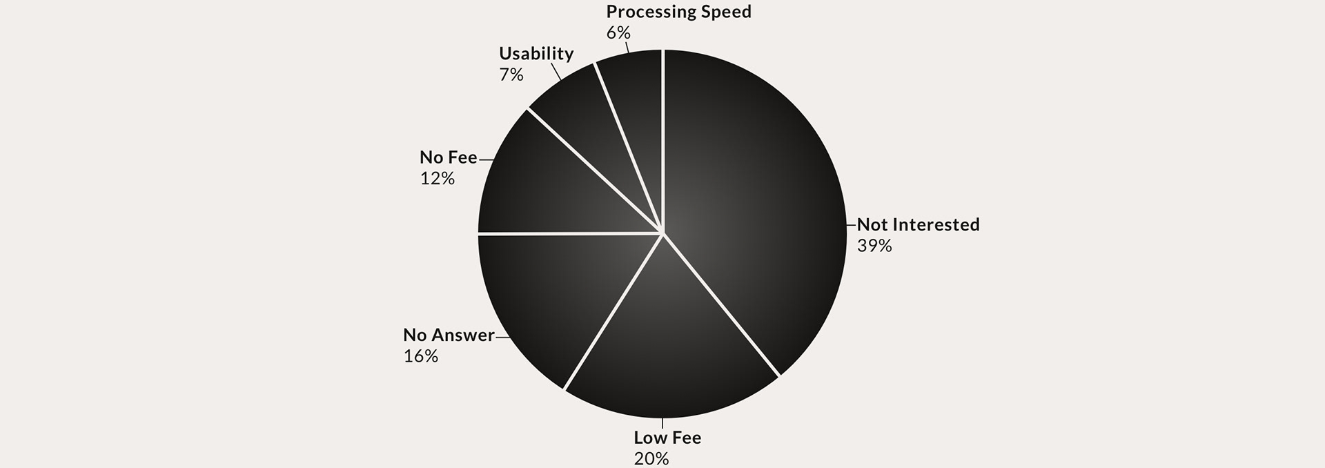
4) What, if anything, would increase the likelihood for you to use Angie's List to collect customer payment?
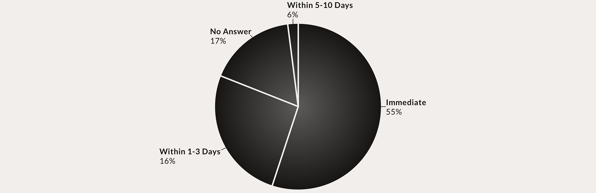
5) What is an acceptable delay time to receive payouts through a payment platform? Immediate, 3 days, 5 days, 10 days, Other (specify)
Observations:
• The majority of pros use Square, PayPal, and Venmo to collect payments, something to keep in mind for visual research.
• Low fees would be are important in deciding to use Angie's List to collect payments.
• Payments have to transfer to the pro's bank account in a secure and timely manner.
Goal & Requirements
With the results of the survey in mind, the goal became:
Improve stickiness of the Angie's List platform for service providers by keeping more of the job transaction process in-platform by providing low transaction fees and secure, fast money transfers.
And the requirements were, through results of the survey and from business needs:
• 0% transaction fees. Angie's List would cover the transaction fees to make Angi Pay more attractive to pros. Square's transaction fees are 2.6% + 10¢.
• Only available to active advertisers (pros who pay to have their business advertised through Angie’s List) via a BMT subscription.
• An open-loop system, available for non-Angie’s List-booked job invoicing as well as Angie’s List jobs.
• Individual transaction size constraints = $1-$100k (Business requirement).
• Has to be offered in addition to the Square integration. Pros must be able to switch back to Square or opt-out of Angi Pay completely if they so choose.
Visual Research
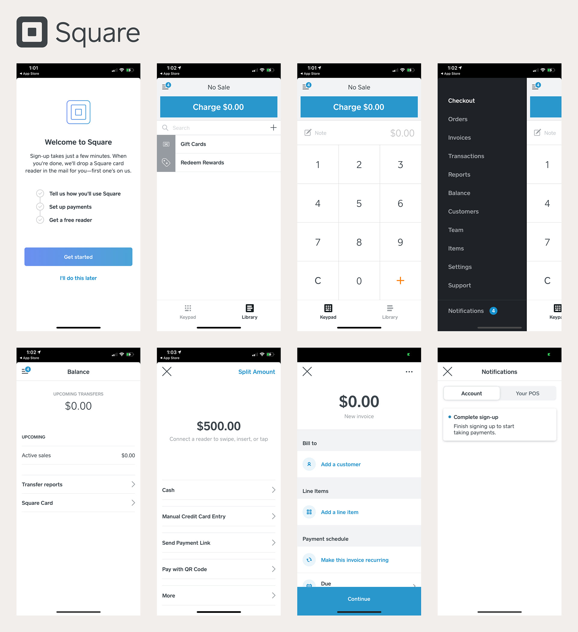
Visual research was conducted before wireframes were created to explore payment platform and request best practices. Square, PayPal, and Venmo were chosen because the survey showed they were the top three payment methods pros were using to collect payments.
Observations
Square
• Having a CTA anchored to a specific and consistent spot, the blue "Charge" button in this case.
• Balances or dollar amounts requested shown at the top of the page, to provide importance through hierarchy.
• Easy to charge or request payment, not too many choices on each screen that can overwhelm the user.
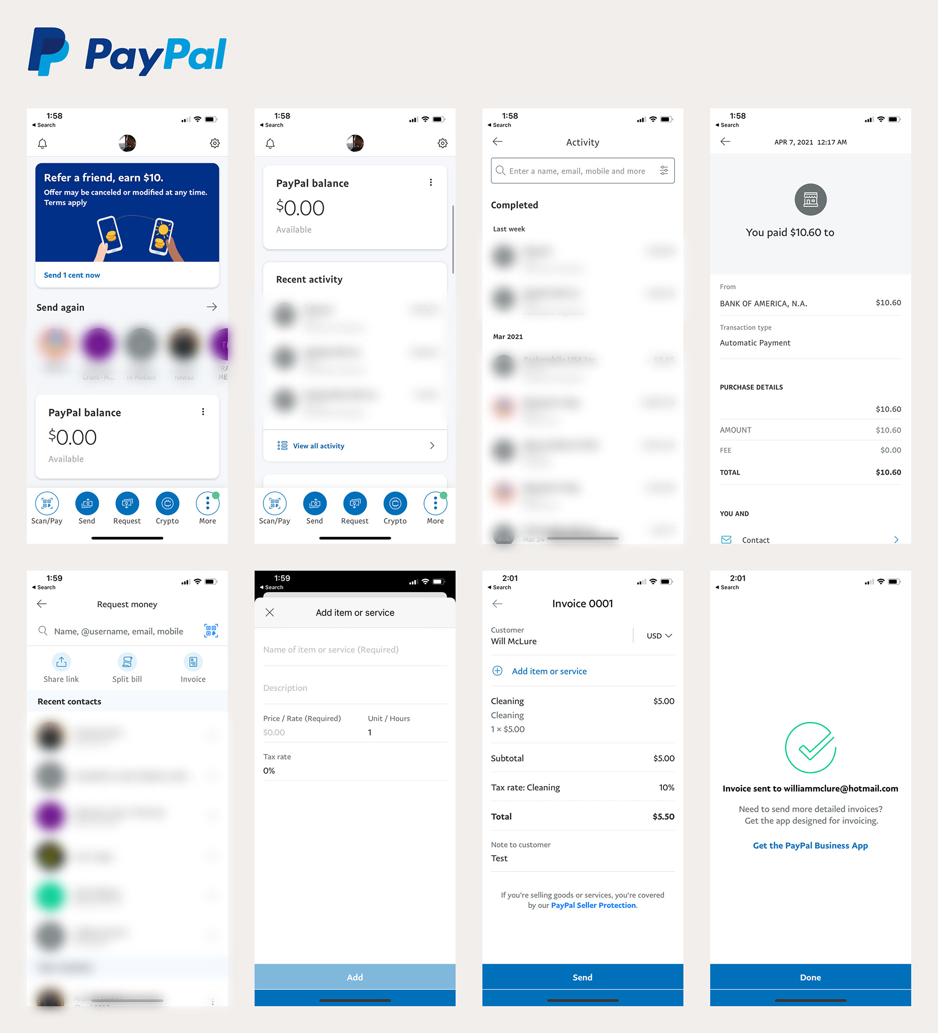
PayPal
• Showing the account balance and recent activity on the home screen, something to keep in mind for Angi Pay Activity, the hub to keep track of payments received and requested.
• 3 most recent contacts are shown when searching for customers to request money from.
• An easy way to create and attach an invoice to a payment request.
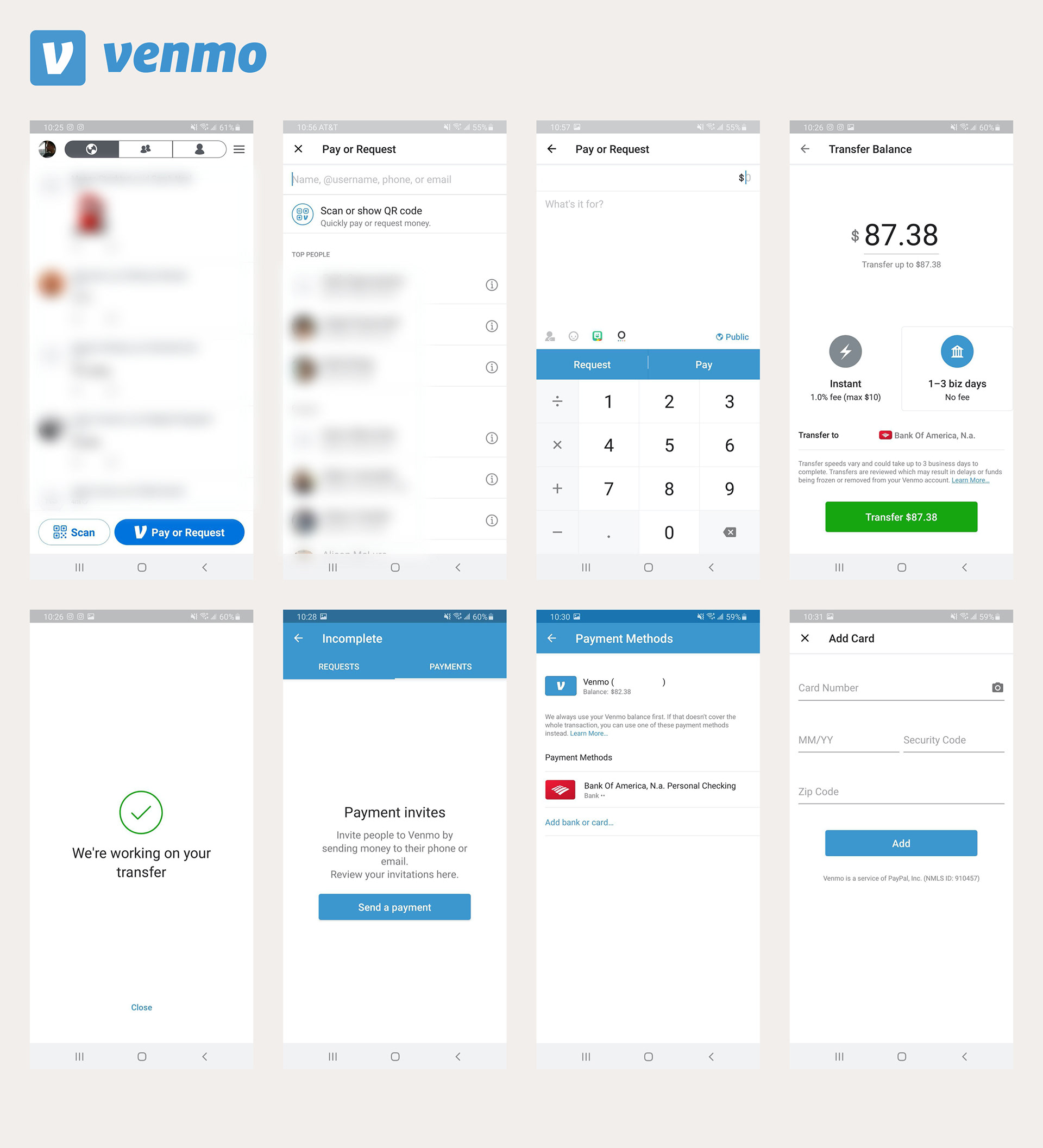
Venmo
• 3 "Top People" (most requested) are shown when searching for customers to request money from.
• A place to see incomplete payment requests.
• A simple way to add bank account or edit an existing account.
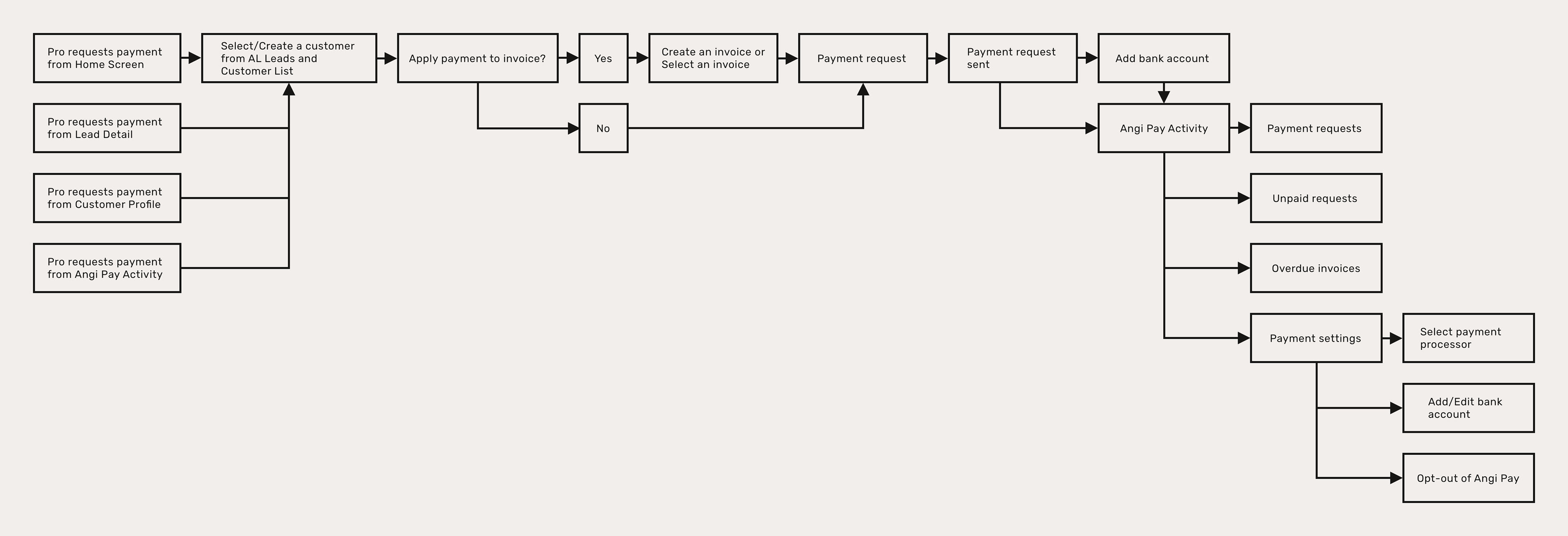
User Flow Chart
Using the survey results, project requirements, and what we learned from looking at Square, PayPal, and Venmo, we came up with a chart to map out all the flows a pro would make within Angi Pay. We did this to keep track of all the different flows for development tickets and to organize the wireframes and InVision prototype.
High-Fidelity Wireframes
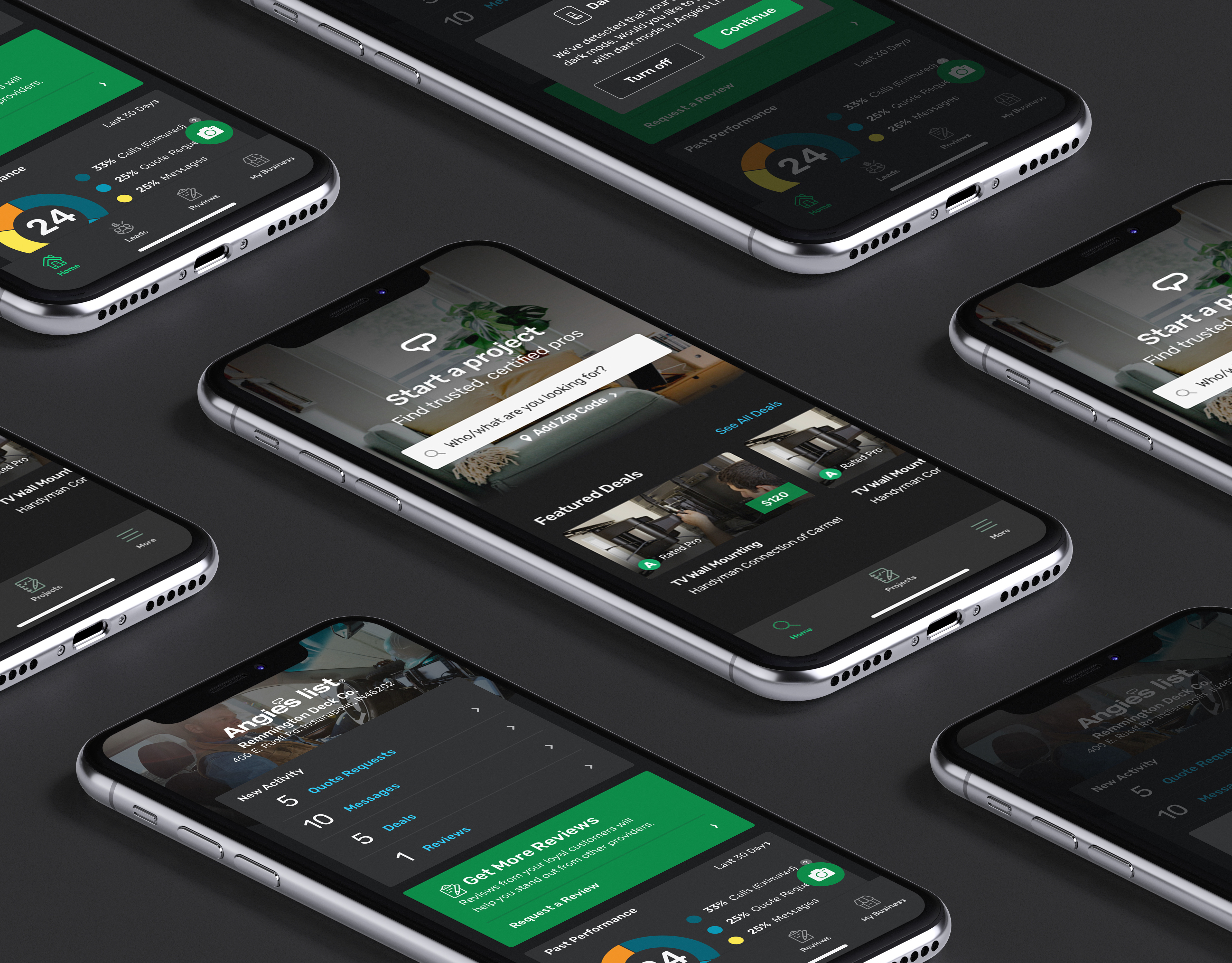
At this point in my design process, I'd ideally like to create low to mid-fidelity wireframes before testing it with users or even getting feedback from internal stakeholders (the design, product, and engineering teams involved). However, given our limited time frame and having an easy-to-use design system that allows for quick wireframing, I created all the user flows in high-fidelity. Another thing the limited time frame affected was our usability testing plan of these user flows, so the wireframes were put in front of the design, product, and engineering teams as many times as possible to get feedback. There were plans to beta test Angi Pay with a select group of pros in November 2020, but with the announcement of the Angie's List to Angi rebrand, those plans were derailed.
Entry Points
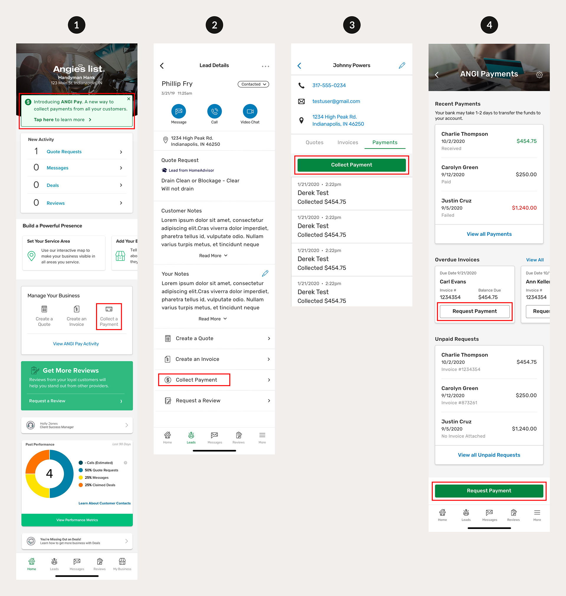
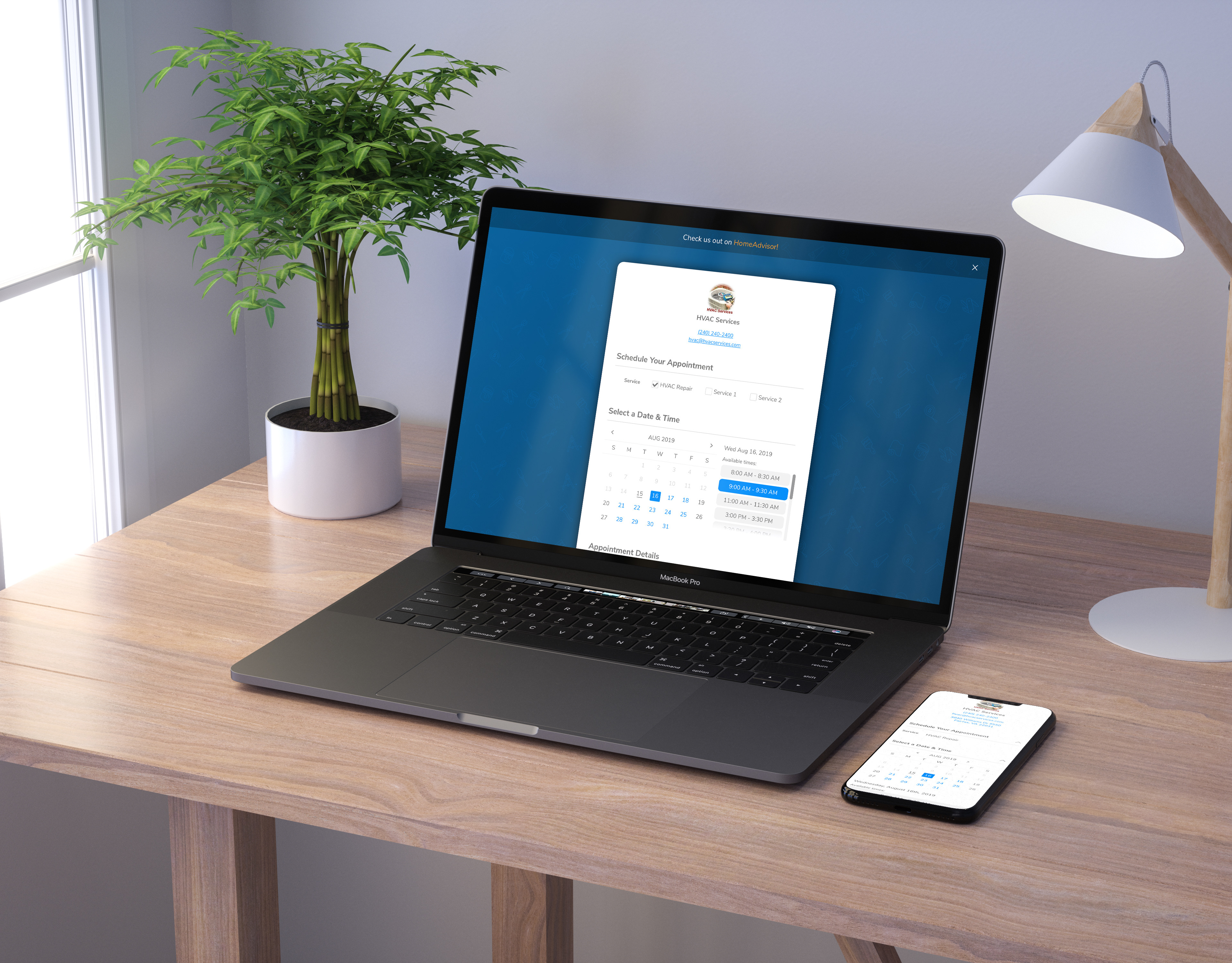
These are the four ways to start a payment request. Screens 1, 2, and 3 were already in the Angie's List pro app. Screen 4 was designed for Angi Pay.
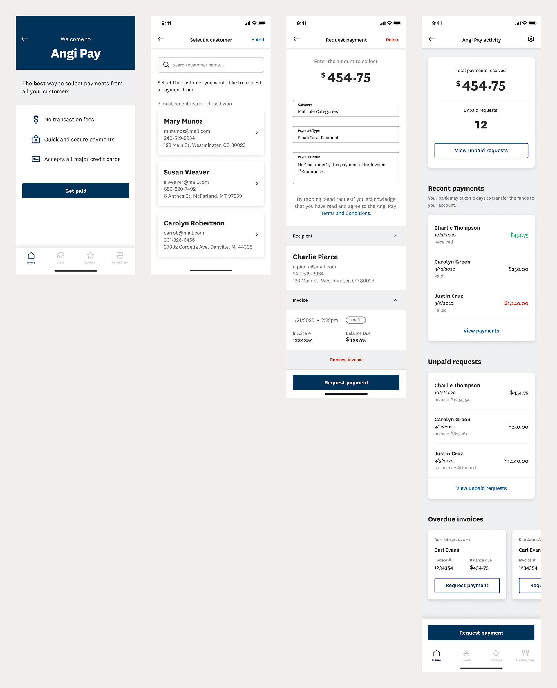
1) Home Screen - Tapping either the green banner at the top to learn more about Angi Pay or the "Collect a Payment" button within the "Manage Your Business" section, the pro will be taken to the "Welcome to Angi Pay" screen (for first-time users) or to the "Select a Customer" screen to choose a customer to request a payment from.
2) Lead Detail - By default, when opening the app, the user is placed on the home screen. If they tab over to the Leads icon in the tab bar, the pro gets a list of their leads. Tapping into a lead will present the lead detail screen that provides more information and options on the lead. Tapping "Collect Payment" will take the pro to the "Welcome to Angi Pay" screen (for first-time users) or to the "Select a Customer" screen to choose a customer to request a payment from.
3) Customer Profile - After a quote, invoice, or payment is created for a lead, the lead turns into a customer. The customer has a profile that includes contact information and all their quotes, invoices, and payments. In the "Payments" tab, the "Collect Payment" CTA takes the user to the "Welcome to Angi Pay" screen (for first-time users) or to the "Select a Customer" screen to choose a customer to select a payment from.
4) Angi Pay Activity - Through the green banner (for first-time users) on screen 1, the My Business tab, or after requesting payment from a customer, the pro is taken to the payments hub or "Angi Pay Activity", a place to keep track of payments requested and received. The pro can enter the request payment flow by tapping the "Request Payment" button in the Overdue Invoices section or the green "Request Payment" CTA at the bottom of the screen.
Alerts/Banners
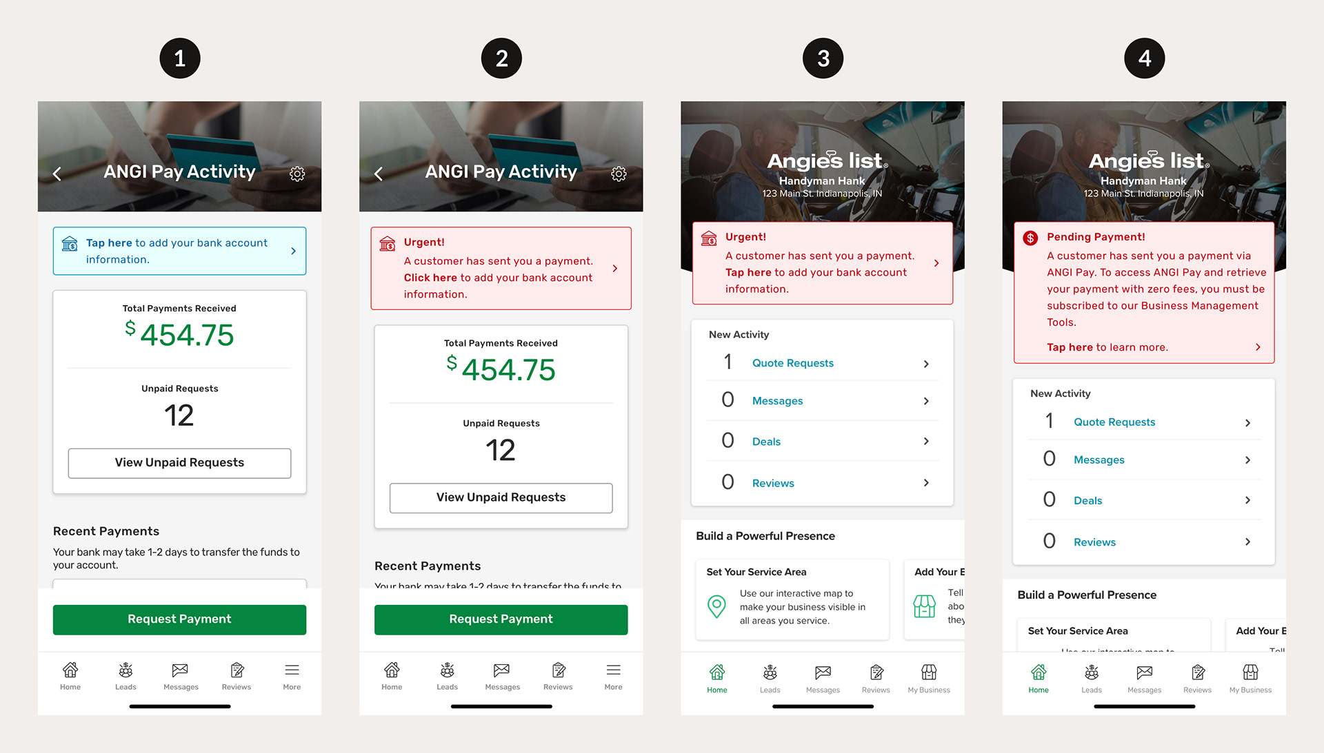
1) Angi Pay Activity, Tap to Add Bank Account - This banner shows on Angi Pay Activity after a pro has requested payment but hasn't added their bank account information yet. Tapping this banner takes them into the two-part Add Bank Account flow.
2) Angi Pay Activity, Tap to Add Bank Account, Urgent - This banner shows on Angi Pay Activity after a pro has received a payment from a customer but hasn't added their bank account information yet. Tapping this banner takes them into the two-part Add Bank Account flow.
3) Home Screen, Tap to Add Bank Account, Urgent - This banner shows on the Home screen after a pro has received a payment from a customer but hasn't added their bank account information yet. Tapping this banner takes them into the two-part Add Bank Account flow.
4) Home Screen, Pending Payment - This banner shows on the Home screen after a pro has received a payment from a customer but isn't signed up for BMT and thus doesn't have access to Angi Pay Activity. On the customer app, a customer can send a payment to a pro without a payment request and without the pro being signed up for BMT and Angi Pay. The pro will need to sign up for BMT to be able to use Angi Pay and retrieve their payment with zero fees.
First Time/Welcome
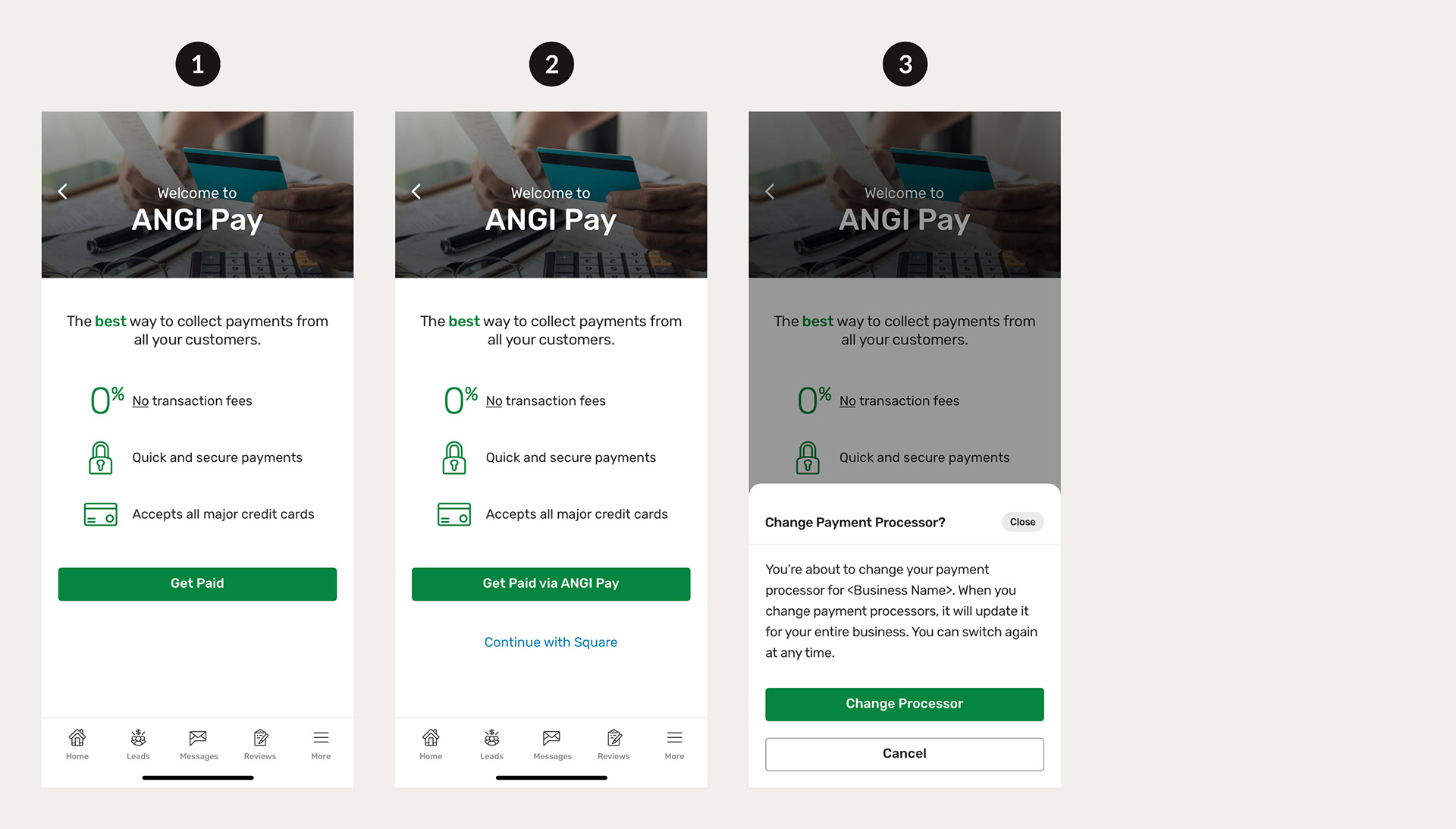
1) Welcome to Angi Pay - This screen is shown to first-time users of Angi Pay. We show the three value props of no transaction fees, quick/secure payments, and accepts all major credit cards, in alignment with results from the survey. The "Get Paid" CTA takes the pro to the "Select a Customer" screen.
2) Welcome to Angi Pay, Square - This screen is shown to first-time users of Angi Pay that have already used Square to take a payment from a customer. There's a blue "Continue with Square" link that allows the pro to continue collecting a payment with Square.
3) Change Payment Processor? - This bottom sheet appears if a pro taps the green "Get Paid via Angi Pay" CTA on screen 2. We ask the pro to confirm that they want to change their payment processor from Square to Angi Pay and let them know they can switch back at any time.
Select a Customer
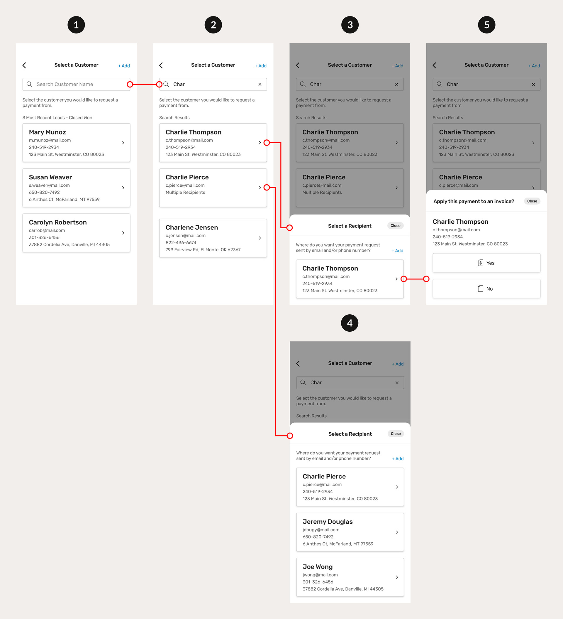
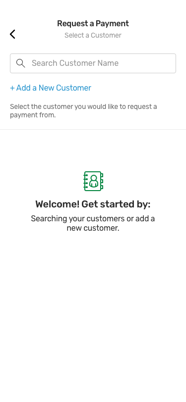
1) Select a Customer, Default - After tapping the "Get Paid" CTA on the "Welcome to Angi Pay" screen, the pro is taken to the "Select a Customer" screen. They can also get to this screen from the entry points mentioned earlier.
Original Design
Internal Feedback:
• In the original design, the “Select a Customer” screen had a welcome message that told the pro how they could get started, by searching for a customer or adding a new customer.
• Feedback was that we should anticipate what the pro would be searching for, instead of stating the obvious.
• The solution we came up with was to show the 3 most recent leads in a “closed won” status, which means the 3 most recent customers that the pro has completed work for and are ready to collect payments from.
• Our solution was consistent with how PayPal and Venmo show their 3 most recent or most popular contacts.
2) Select a Customer, Search - As the user enters characters into the search box, the 3 most recent leads are replaced by the search results.
3) Select a Recipient, One Recipient &
4) Select a Recipient, Multiple Recipients - After tapping one of the customer cards from the 3 most recent leads or the search results, the pro is presented with a "Select a Recipient" bottom sheet.
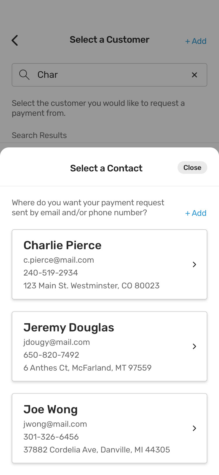
Original Design
Internal Feedback:
• In the original design, the “Select a Recipient” bottom sheet and specifically the word “Recipient” used everywhere was “Contact”. This word is from the BMT integration and previously mHelpDesk. To explain the concept of a contact under a customer, an example I like to use is McDonalds. If a HVAC pro is working on a McDonalds location, the customer would be McDonalds, and the contact would be the specific McDonalds location, so it makes sense that a customer could have multiple contacts (locations).
• Angie’s List is mostly focused on homeowners with one location, so homeowners with multiple homes are a small minority. There was some confusion around contacts and if they would be useful to our pros. Some of the confusion was around the word “contact” specifically.
• Our short-term solution was to change “contact” to “recipient” to help the pro know that this specific email/phone number is where the payment request is going to be sent to.
• Our long-term solution is to re-evaluate the concept of a “contact” or “recipient” and explore the option of taking it out completely to avoid confusion for the majority of our pros.
5) Apply this payment to an invoice? - Tapping a recipient card from the "Select a Recipient" bottom sheet transitions the sheet to the "Apply this payment to an invoice?" bottom sheet with the recipient information and "Yes" or "No" options.
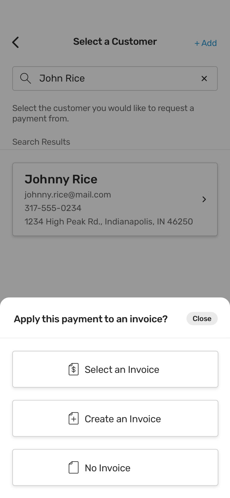
Original Design
Internal Feedback:
• In the original design, the “Apply this payment to an invoice?” bottom sheet had three options instead of two. The options were:
1) “Select an Invoice” would take the user to a list of the selected customer’s invoices.
2) “Create an Invoice” would go to the invoice builder.
3) “No Invoice” would go to the Request Payment screen.
• Feedback was that there were too many choices and we should try to narrow it down (Hick's Law).
• We decided to cut the choices down to two, with simpler copy, by using a simple “Yes” or “No”. With “Yes” going to a new screen with the option to create an invoice or select an invoice, and “No” going to the Request Payment screen.
Request Payment - With & Without an Invoice
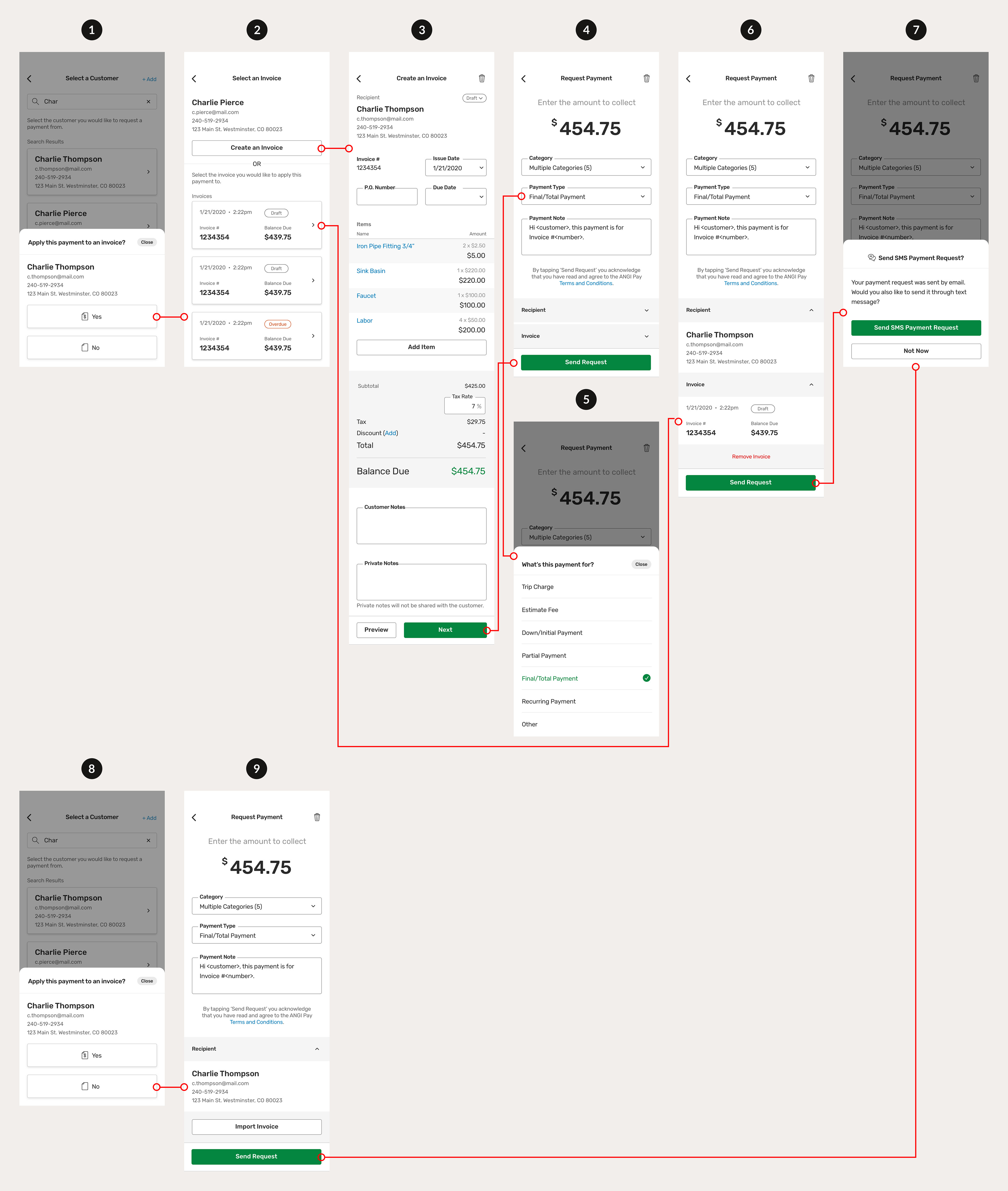
1) Apply this payment to an invoice? Yes - Tapping this option takes the pro to the "Select an Invoice" screen.
2) Select an Invoice - Here the pro can choose to "Create an Invoice" or select an existing invoice that has been created for this customer.
3) Create an Invoice - If the pro chooses to "Create an Invoice", they can build an invoice to attach to the payment request by setting a due date, adding line items, taxes, discounts, and customer notes. Tapping the green "Next" CTA will take them to the "Request Payment" screen.
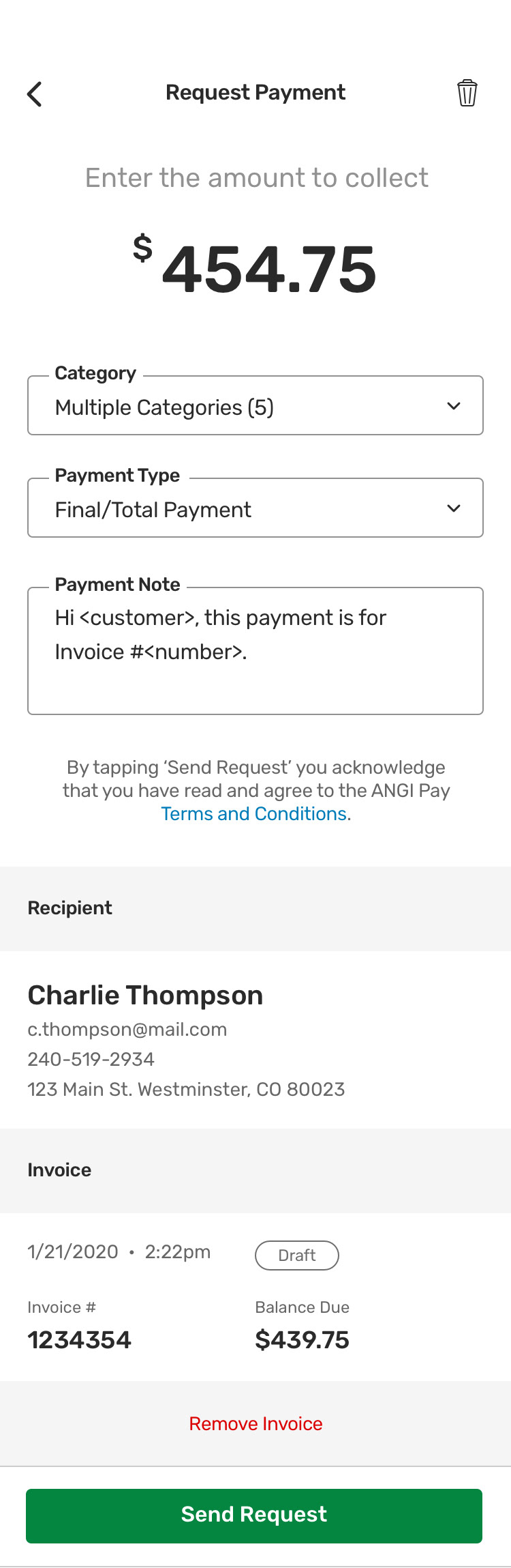
4) Request Payment, Condensed - The amount shown at the top of this screen is pre-populated from the balance due amount on the previous "Create an Invoice" screen. The pro also has the option to edit this amount by tapping on it. They can add categories to this payment request, for example, if this was a job that involved multiple tasks such as roofing and gutter cleaning, they could add both. They can choose the payment type (screen 5) and add a payment note (separate from the invoice customer note, since a payment request doesn't require an invoice). The recipient and invoice information from the previous screen is revealed by the chevron icons on the right (screen 6).
6) Request Payment, Expanded - If the pro chooses to select an invoice from screen 2, they go directly to the Request Payment screen, with the invoice selected pre-populated.
Original Design
Internal Feedback:
• In the original designs, the Recipient and Invoice information at the bottom were always exposed without the ability to expand/collapse.
• Feedback was that this made the page feel “too busy” and that there were too many things for the pro to look at once coming to this screen for the first time.
• Our solution was to add chevron icons and the ability to expand/collapse the Recipient and Invoice information. The default state for these two sections would be collapsed when the pro comes to this screen.
• This would allow the pro to focus on the amount they are collecting and any payment details they need to add.
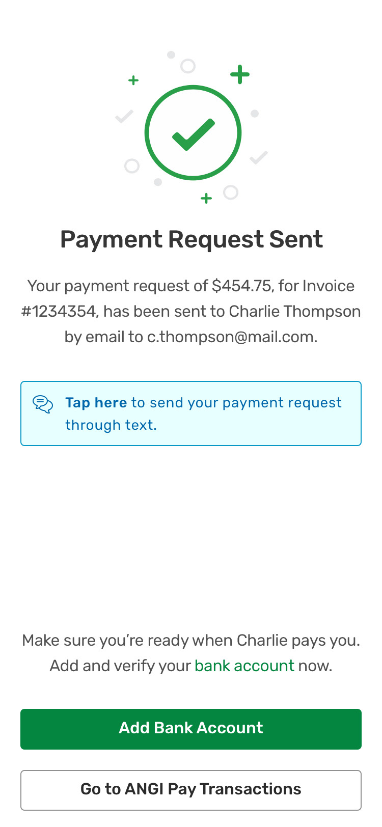
7) Send SMS Payment Request? - After tapping the "Send Request" CTA on the Request Payment screen, the pro is presented with a "Send SMS Payment Request?" bottom sheet where they're informed that the payment request has already been sent by email and they can choose to also send it by text message to their customer's phone number.
8) Apply this payment to an invoice? &
9) Request Payment - Tapping "No" on the "Apply this payment to an invoice?" bottom sheet will take the pro directly to the Request Payment screen, with no invoice attached.
Payment Request Sent
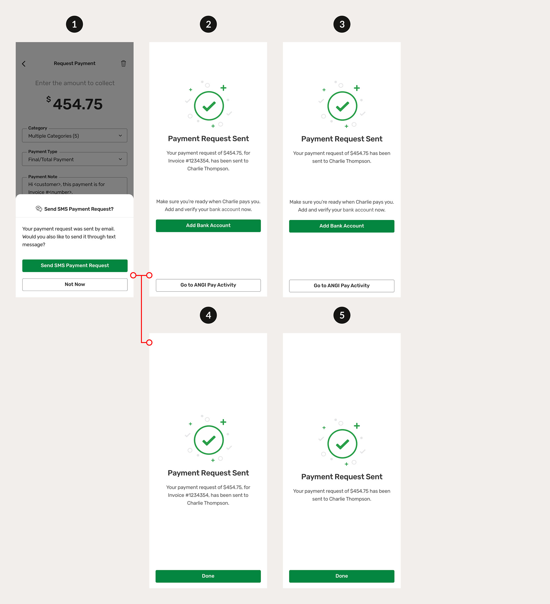
1) Send SMS Payment Request? - By tapping the green "Send SMS Payment Request" CTA and coming back to Angi Pay or tapping the "Not Now" button below the CTA, the pro is taken to the Payment Request Sent confirmation screen.
2) Payment Request Sent, Invoice - Confirms the requested amount, the invoice number, and the customer's first and last name. There's a CTA to add their bank account information if they haven't already and a button to go to Angi Pay Activity.
3) Payment Request Sent, No Invoice - Confirms the requested amount and the customer's first and last name. There's a CTA to add their bank account information if they haven't already and a button to go to Angi Pay Activity.
4) Payment Request Sent, Invoice, Bank Account Added - Confirms the requested amount, the invoice number, and the customer's first and last name. There's no CTA to add their bank account information because it's already been added and there's a "Done" CTA to go to Angi Pay Activity.
5) Payment Request Sent, No Invoice, Bank Account Added - Confirms the requested amount and the customer's first and last name. There's no CTA to add their bank account information because it's already been added and there's a "Done" CTA to go to Angi Pay Activity.
Original Design
Internal Feedback:
• In the original designs, there was no “Send SMS Payment Request?” bottom sheet before the “Payment Request Sent” confirmation screen.
• Instead, we were exploring options between a "Send Payment Request by SMS" link or button on the “Payment Request Sent” screen.
• We received feedback on the “Payment Request Sent” screen feeling “too busy” with too many CTAs (three).
• We decided to move the option to send payment requests by SMS to an easily dismissed bottom sheet, right after the pro taps “Send Request” on the Request Payment screen.
• This gives the pro clarity to decide on the SMS bottom sheet and gives more importance to the “Add Bank Account” CTA on the Payment Request Sent screen.
Add Bank Account
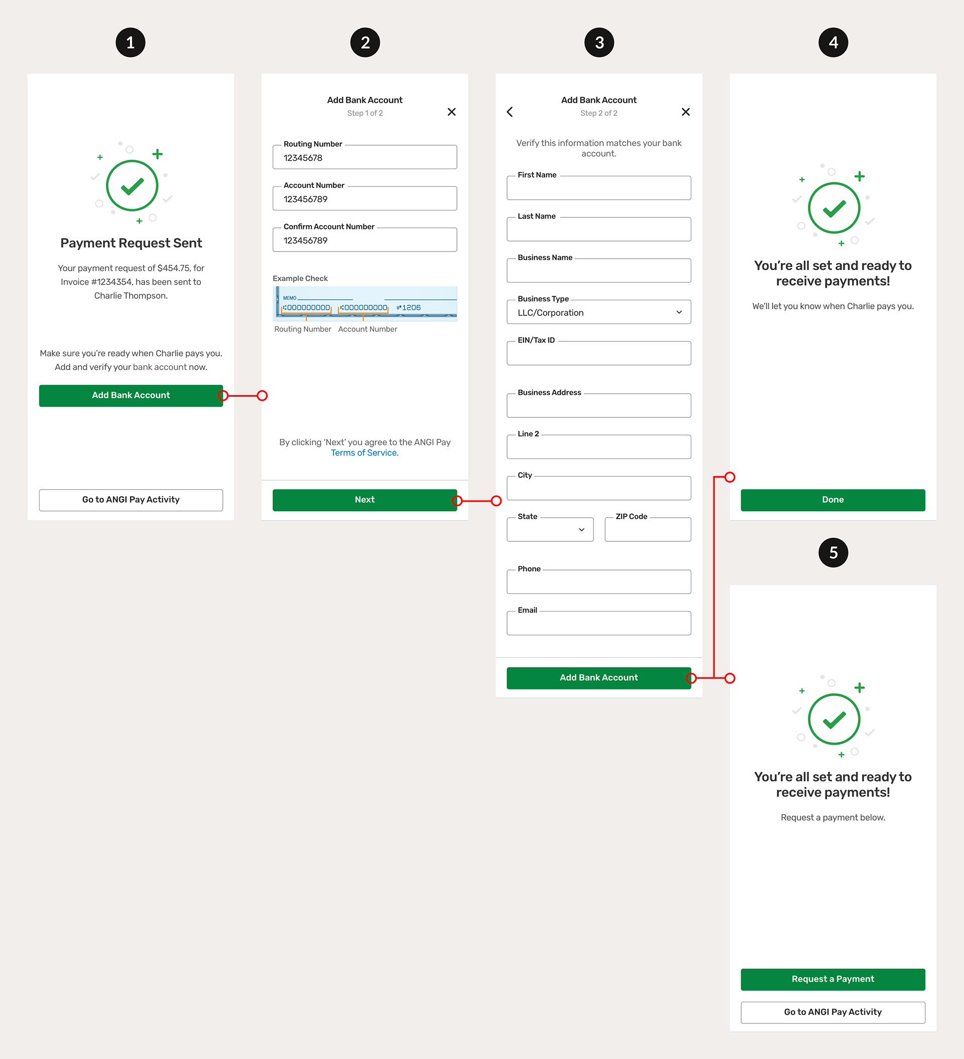
1) Payment Request Sent - Tapping the green "Add Bank Account" CTA on this screen will take the pro to the "Add Bank Account, Step 1 of 2" screen.
2) Add Bank Account, Step 1 of 2 - Here the pro can enter their bank account's routing and account numbers, with an example check of where to find both. Tapping the green "Next" CTA will take the pro to step 2 (screen 3).
3) Add Bank Account, Step 2 of 2 - Here the pro enters the rest of their bank account information: business name, address, and contact information. Tapping the green "Add Bank Account" CTA will take the pro to either screen 4 or 5, depending on when they are adding their bank account information.
4) Ready to Receive Payments, After Payment Request - If a pro is adding their bank account information after making a payment request, they are presented with this confirmation screen and the green "Done" CTA takes them to Angi Pay Activity.
5) Ready to Receive Payments, Before Payment Request - If a pro is adding their bank account information before making a payment request, usually through the Payment Settings, they are presented with this confirmation screen. The green "Request a Payment" CTA takes them to the Select a Customer screen and the "Go to Angi Pay Activity" button takes them to Angi Pay Activity.
Angi Pay Activity
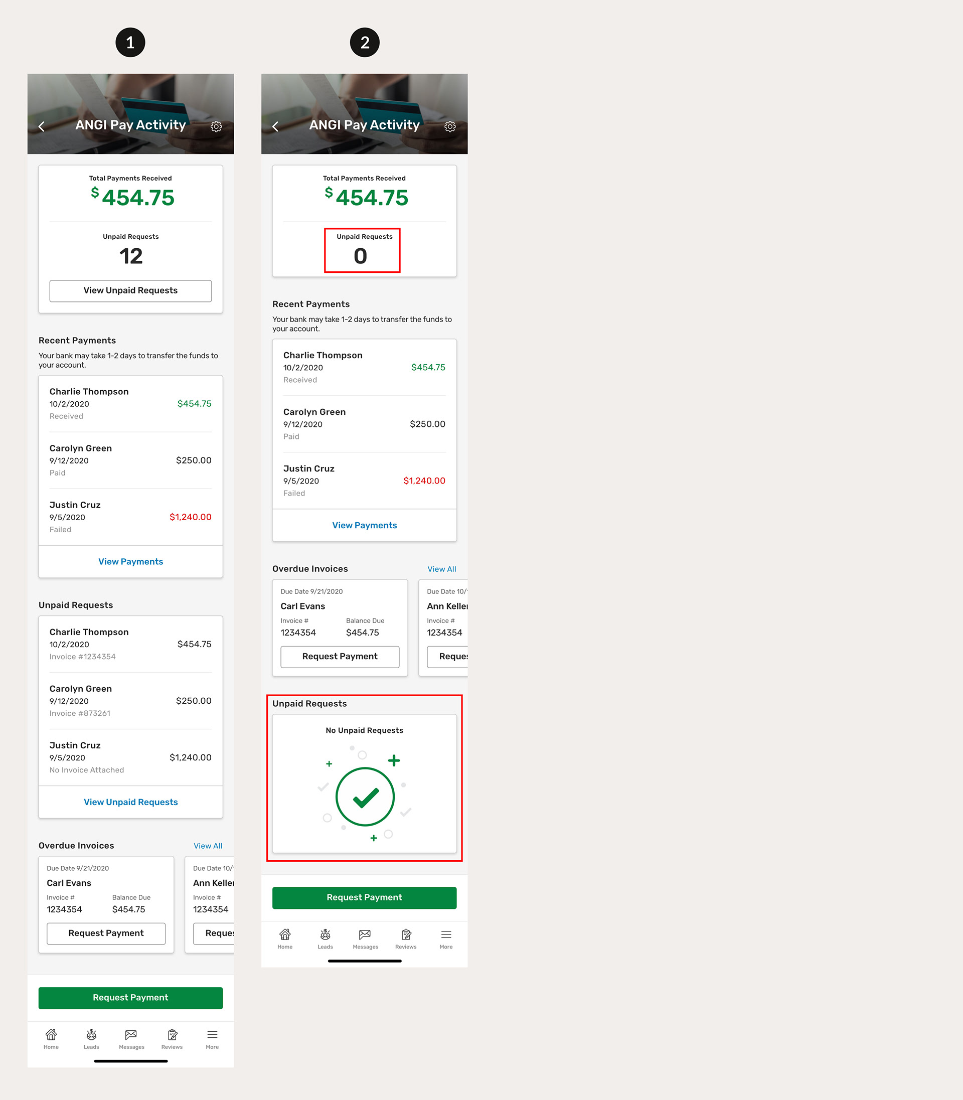
1) Angi Pay Activity - This is a payments hub where the pro can track:
• Unpaid payment requests (payment requests sent but not paid yet)
• Payments being transferred, received, or failed
• Overdue invoices
And:
• Can access the Payment Settings at the top
• Can request a payment with the green CTA at the bottom
2) Angi Pay Activity, No Unpaid Requests - When the pro has no outstanding payment requests (all requests are paid), they are presented with an "Unpaid Requests" empty state at the bottom.
Internal Feedback:
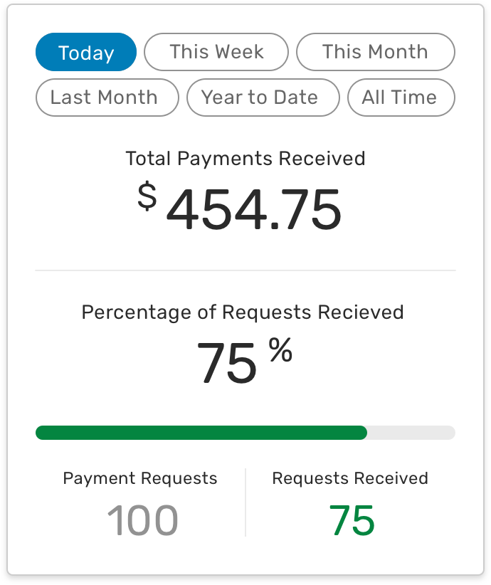
• In the original design, the “Total Payments Received” section included more information and was included in a “Metrics” section at the bottom of the Angi Pay activity, below “Overdue Invoices”.
• The section included filters by time frame, the dollar amount of total payments received, the percentage of payments received, and a progress bar with payments received being tracked on top of payment requests.
• Feedback was that this section would be very useful for pros but it should be on its separate page instead of on Angi Pay Activity.
• They felt this was good information to expand upon on its page where pros could also run customized reports on their payments. This separate page would be something we would explore in the future after further user testing/validation of assumptions.
• The solution we came up within the final design included moving the “Total Payments Received” section to the top, to give more prominence and importance.
• The number of unpaid requests, with a button to access the unpaid requests, was added below the total payments received. This was added because we assumed pros would want to see how many outstanding requests they had upfront and a button to get to them quickly.
Payment Settings
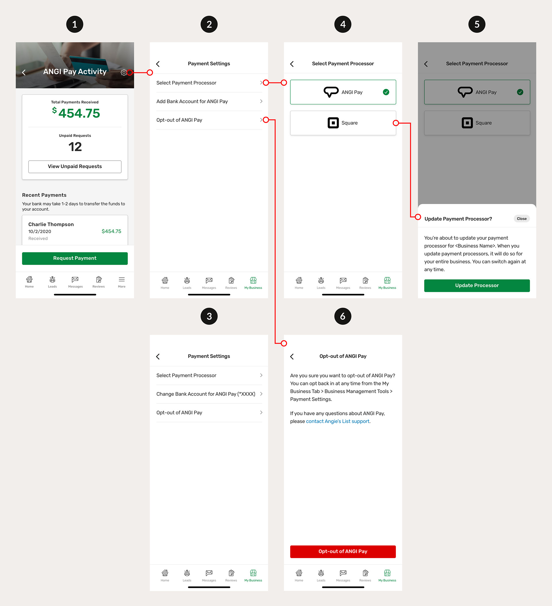
1) Angi Pay Activity - By tapping the cog icon in the top right, the pro is taken to their Payment Settings.
2) Payment Settings - Here the pro has three options:
• They can select a payment processor
• Add their bank account for Angi Pay
• Opt-out of Angi Pay
3) Payment Settings, Bank Account Added - Here the pro has already added their bank account (the last 4 digits of the account are shown).
4) Select Payment Processor - The pro can change their payment processor from Angi Pay to Square or Square to Angi Pay.
5) Update Payment Processor? - The pro is asked to confirm that they want to change their payment processor.
6) Opt-out of Angi Pay - The pro is asked if they're sure they want to opt-out of Angi Pay and where they can go to opt back in or contact Angie's List support. There's a red "Opt-out of Angi Pay" CTA at the bottom.
Recent Payments
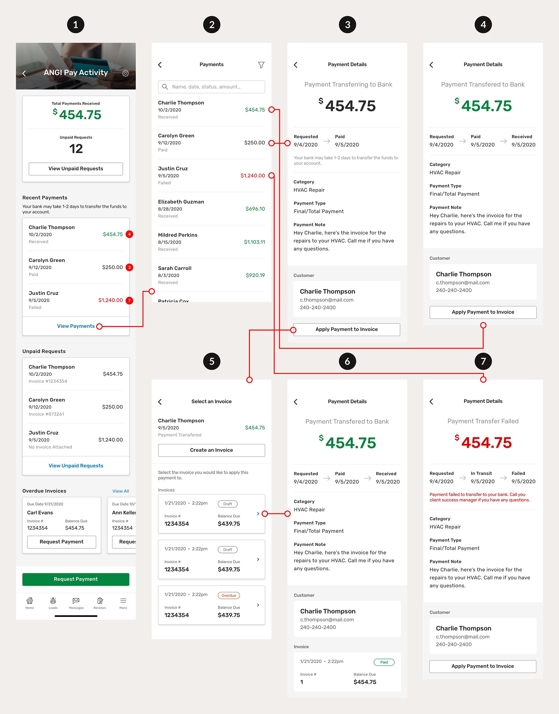
1) Angi Pay Activity - In the "Recent Payments" section, tapping the blue "View Payments" link will bring the pro to the Payments screen (screen 2).
2) Payments - This is a list of all the payments a pro has been "Paid" (being transferred to the bank), "Received" (transferred to the bank), or "Failed". A search bar and filter option are part of these designs but didn't make it to production for development reasons, although there are plans for it to be added soon. Clicking on a payment will take the pro to screen 3, 4, 6, or 7, depending on what the payment status is and if there's an invoice attached.
3) Payment Details, Paid - When a pro taps on a "Paid" payment from screen 1 (red dot 3) or screen 2, they are presented with a screen that gives more details on the payment such as the "Requested" and "Paid" dates, the category, payment type, and payment note, as well as the customer information and an option to apply the payment to an invoice.
4) Payment Details, Received - A "receipt" of a fully paid payment request. It has all the payment details of screen 3 with the added "Received" date in its timeline.
5) Select an Invoice - Tapping the "Apply Payment to Invoice" button on screens 3, 4, and 7 will take the pro to the Select an Invoice screen where they can create a new invoice or select an existing invoice.
6) Payment Details, Paid, Invoice Attached - This is what a "Received" payment request looks like with an invoice attached.
7) Payment Details, Failed - If the payment request is paid but there are issues with transferring the amount to the pro's bank account for some reason, we show a Payment Details screen with a "Failed" status and give the reason it failed and how to fix it.
Unpaid Requests
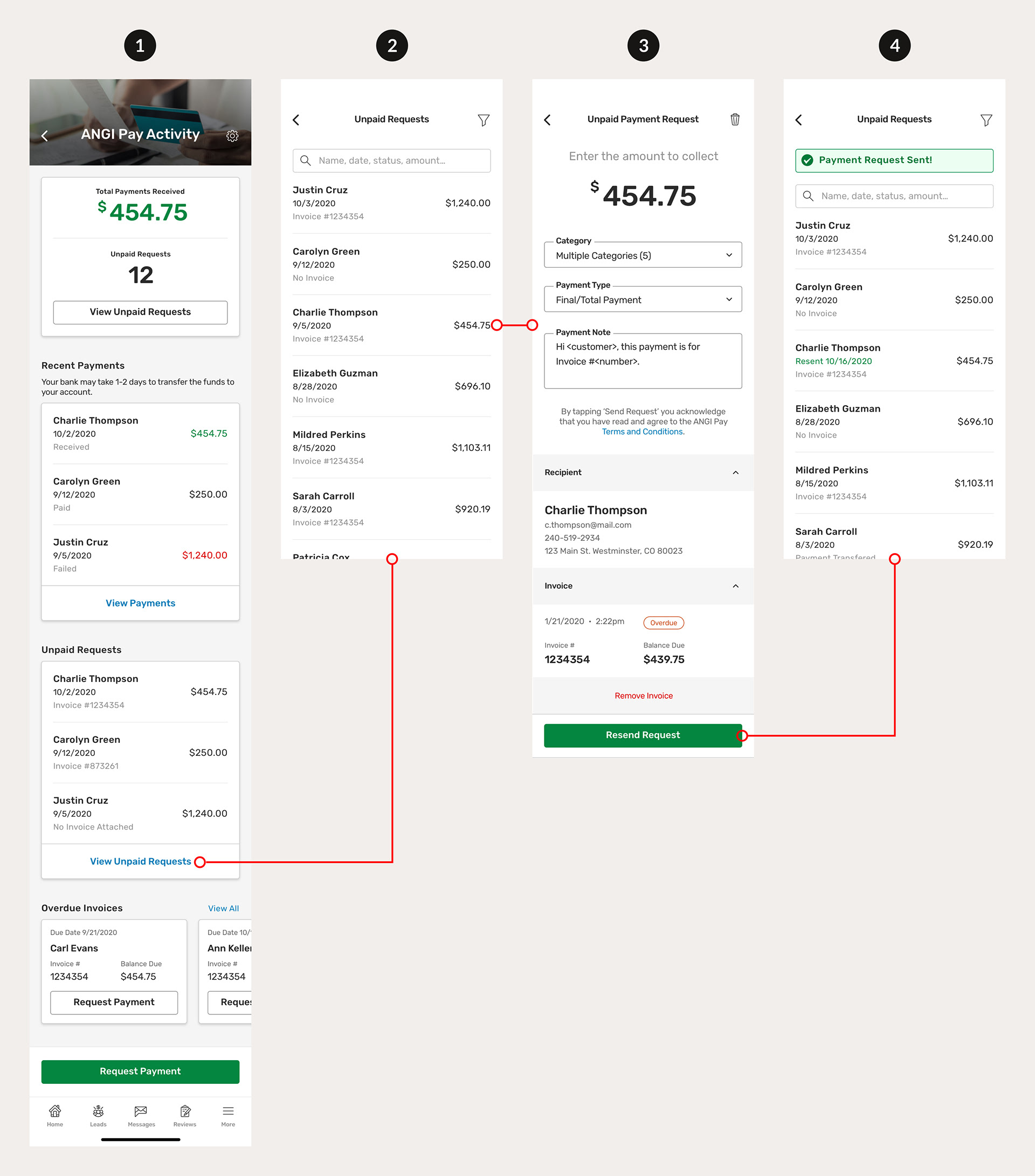
1) Angi Pay Activity - In the "Unpaid Requests" section, tapping the blue "View Unpaid Requests" link will bring the pro to the Unpaid Requests screen (screen 2).
2) Unpaid Requests - This is a list of all the payments a pro has requested but has not been paid yet. Similar to the payments list mentioned in the section above (screen 2), a search bar and filter option are part of these designs but didn't make it to production for development reasons, although there are plans for it to be added soon. Clicking on an unpaid request will take the pro to a detailed view of an Unpaid Payment Request (screen 3).
3) Unpaid Payment Request - All the fields from the original payment request are pre-populated and there's a green "Resend Request" CTA to send another request to the customer.
4) Unpaid Requests, Payment Request Sent! - Once the unpaid request has been resent to the customer, the pro is taken back to the Unpaid Requests (screen 2) and a green toastr with "Payment Request Sent!" appears at the top of the page for a few seconds before disappearing.
Overdue Invoices
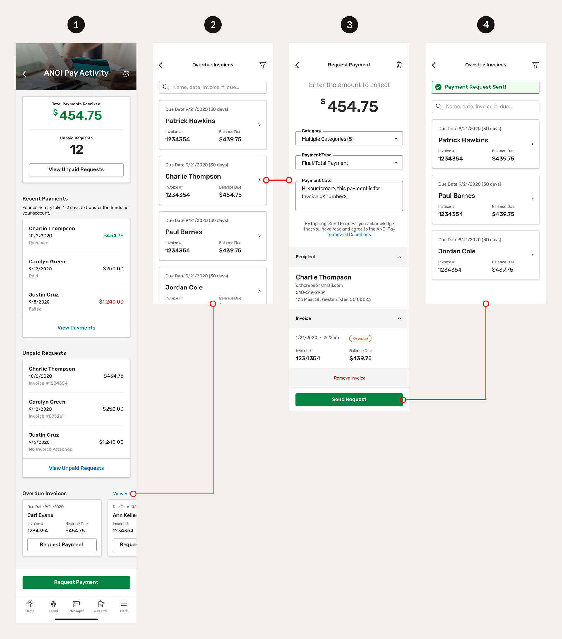
1) Angi Pay Activity - In the "Overdue Invoices" section, tapping the blue "View All" link will bring the pro to the Overdue Invoices screen (screen 2).
2) Overdue Invoices - This is a list of all the invoices that are past their due date and don't have payment requests attached to them. They are sorted by most recently past due. Similar to the payments and unpaid request screens mentioned in the two sections above, a search bar and filter option are part of these designs but didn't make it to production for development reasons, although there are plans for it to be added soon. Clicking on an overdue invoice will take the pro to the Payment Request screen with the overdue invoice pre-populated (screen 3).
3) Request Payment - All the fields from the original payment request are pre-populated and there's a green "Resend Request" CTA to send another request to the customer.
4) Unpaid Requests, Payment Request Sent! - Once the unpaid request has been resent to the customer, the pro is taken back to the Unpaid Requests (screen 2) and a green toastr with "Payment Request Sent!" appears at the top of the page for a few seconds before disappearing.
Angi Rebrand
As mentioned earlier, there was an Angie's List to Angi rebrand and Angi Pay was included in this rebrand that involved updating all the UI. All colors, fonts, buttons, text fields, and icons were changed but the user experience remained the same. Here's a preview of some of the main Angi Pay screens with the Angi rebrand applied.
Next Steps
Angi Pay was released with the Angi rebrand on March 17th, 2021. Plans for Angi Pay include:
• Follow up on usage metrics to determine how many pros are using Angi Pay to collect payments from their customers.
• Gather feedback from the pros using Angi Pay through surveys and interviews to improve the UX.
• Revisit the customer/contact topic and transition towards removing the concept of contacts (recipients in Angi Pay).
• Revisit the metrics section within Angi Pay Activity. This will be another thing to put in front of pros to determine usefulness.
Final Thoughts
Despite our limited time frame and the Angi rebrand pivot, I believe we came up with an easy-to-use in-app payments platform that pros will enjoy using to collect payment for work they've completed. I'm excited to hear feedback on what pros think about how we can improve on requesting payments and keeping track of payments using Angi Pay Activity. Ideally, I would have loved to conduct usability testing with pros before its release but I'm happy with the designs released and glad to see all the hard work my team put in to enhance our users' Angi experience.